“Gestalt” is taken from a German word meaning “form” or “shape”. To a lay man, “Gestalt” is a way of saying something is being seen in its totality, as opposed to seeing it in terms of the components that make it up.
In Logo design, Gestalt Principles are the basic principles required to create meaning in the visual world. They are essential to the designing of logos. “Gestalt principles” as a whole is a very broad topic, but we’ll try to explain it in the most basic way.
There are five Gestalt principles which include:
1. The Figure-Ground Principle
The figure-ground principle states that “when a smaller shape is surrounded by a larger uniform area, we perceive the smaller object to be in front and have the border.” This effect is used to create a depth for a simple logo, such that there is a deep illusion created as long as the surface is uniform. When next you see a logo with a small text and a uniform area, check and you’ll find out that the text (which is smaller) or whatever the object is, will always appear in front and will sure seem to have the border.

Figure-ground logos example: Pittsburgh Zoo & PPG Aquarium, Toblerone, Hope for African Children Initiative.
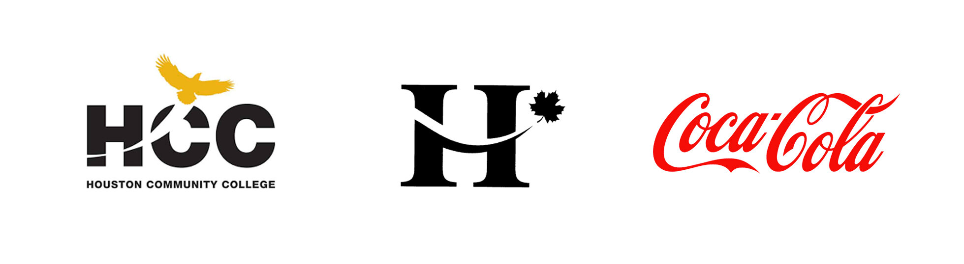
2. Proximity Principle
It states that “If a series of objects (like lines) are put together, we perceive the objects that are more proximal to each other as a group.” A popular logo which uses the principle is the logo of IBM. Despite the fact that the entire logo is made of long horizontal lines, it is easier to see “I”, “B” and “M” as individual characters (in spite of the fact that the alphabets are seen in a vertical form).

Proximity logo example: Paul Rand’s IBM logo.
3. Similarity Principle
The gestalt principle of similarity states that “objects that are similar in shade, orientation, shape or color tend to be grouped together.” For instance, if there are three alphabets and one triangle (somewhere in the middle of the alphabets) that make up a logo, one tends to read the three alphabets as the entire writing without considering the shape as a part of it. The shape could be a triangle, which represents an “A”. That “A” would be necessary for forming a full and correct word. MOCA (Museum of Contemporary Art) logo is a perfect example of this principle.
Similarity logo example: MOCA (Museum of Contemporary Art), by Ivan Chermayeff and Tom Geismar, 1979.
4. Continuance Principle
It states that “If a curve or line segment has an alignment; it is usually considered part of a continuous whole”. Most people conform to this principle and would rather hold that it is an incomplete alphabet or shape.
Continuance logo examples.
5. Closure Principle
It holds that “When the human mind sees a figure that seems loose or not fully closed, we have a tendency to close it up in our imagination.” Many famous logos make use of this principle as a way of standing out.

Closure Logo examples: WWF, Adobe, USA Network.